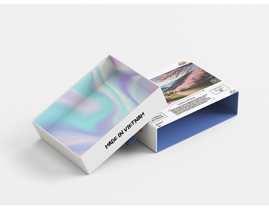
The Story of Spring: Premium Holographic Coffee Packaging
This packaging proposal combines calmness and vitality to make opening a box of premium Vietnamese coffee mix more enjoyable. The design is based on the difference between a peaceful, traditional outside and a bright, modern inside. This is like the "awakening" that occurs with the first cup of coffee in the morning.
ROCK COFFEE
Visual Direction/Brand Identity
Photoshop, Illustration
Behind the Design
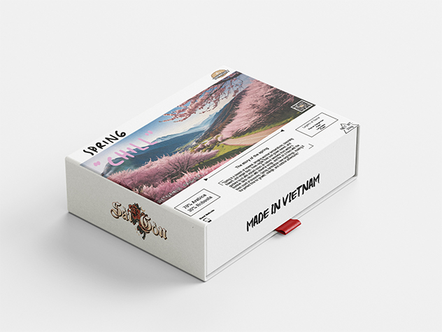
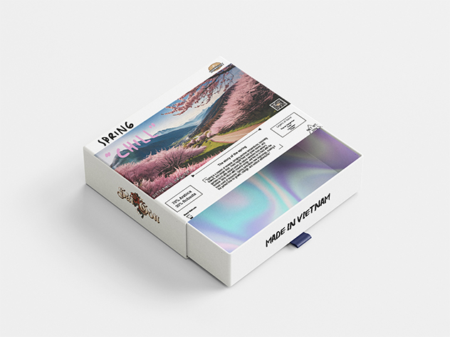
The design direction for this packaging aimed to merge clean minimalism with a premium, contemporary feel, using strong white space and precise typography to keep the system clear and product-forward. A soft iridescent interior finish adds a sense of surprise and luxury, while the bold “MADE IN VIETNAM” mark brings identity and confidence. The structure and layout are intentionally simple so the form, print details, and unboxing experience become the main focus.
- Discover: Define the brand’s core message—modern, refined, and proudly local—and the emotion the unboxing should evoke.
- Explore: Test the box structure, label layout, and visual hierarchy (front panel vs. side mark vs. interior) to balance clarity and impact.
- Refine: Polish micro-details—alignment, spacing, print consistency, and finish effects—so the packaging feels cohesive, elevated, and production-ready.
The Result
The result is a premium packaging concept that feels both minimal and high-end. A crisp white exterior and clean typography create strong clarity and shelf presence, while the iridescent interior delivers a luxurious “surprise” moment during unboxing. The bold “MADE IN VIETNAM” detail adds confident identity, and the structured layout keeps all information organized—making the final piece feel modern, polished, and retail-ready.
Next project